explicitdata.art portfolio details and explanations about each data art we made
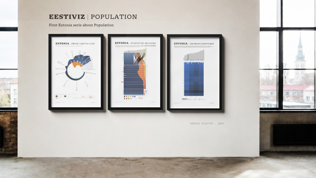
I started the population piece in 2025, and I've been building out the rest of the series since. Each piece follows the same principle behind my practice: information that reads as an abstract, minimal pattern from a distance and resolves into precise data up close. I call this technique double reading, and it runs through everything I make. Why Estonia? I spent my Erasmus semester in Tallinn in 2005, just over twenty years ago, studying at Tallinn Technology University (TalTech). That's where I found the country I feel most aligned with : the calm, the landscape, but also the tech scene and…
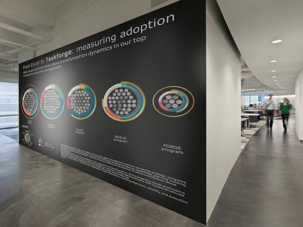
Why I chose this subject Digital transformation is often framed as a technology problem.
In reality, it's an adoption issue. In this visualization presentation, we will see how data art helps in enterprise software adoption. Organizations invest heavily in tools designed to improve coordination, visibility, and execution. The real challenge is not deployment but its usage. This is a critical topic in business because software cost money while it should increase teams efficiency. A lack of of adoption is a lose-lose deal for a company. Project management tools are a perfect example. Moving from spreadsheets to structured platforms promises efficiency, alignment, and…
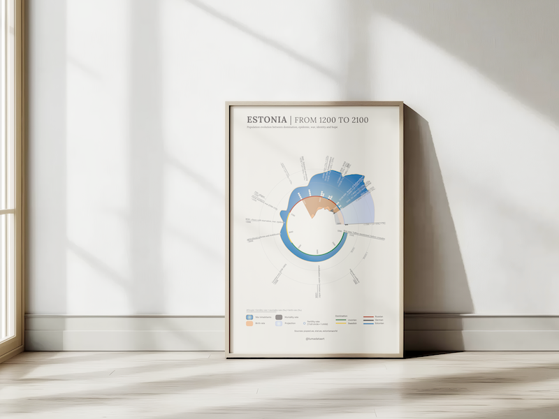
Why I Chose This Subject I went to Estonia during my Erasmus program in 2005, and I found my heart country there—a place I return to at least once or twice a year. Generally speaking, everything related to Estonia interests me, and what better way to know a country than to discover its history? In France, we learn little about the history of this part of Europe, even though it's very complex and difficult to grasp compared to our own. Through the lens of population numbers and their evolution across centuries, I decided to trace Estonia's history through a graph that illustrates…
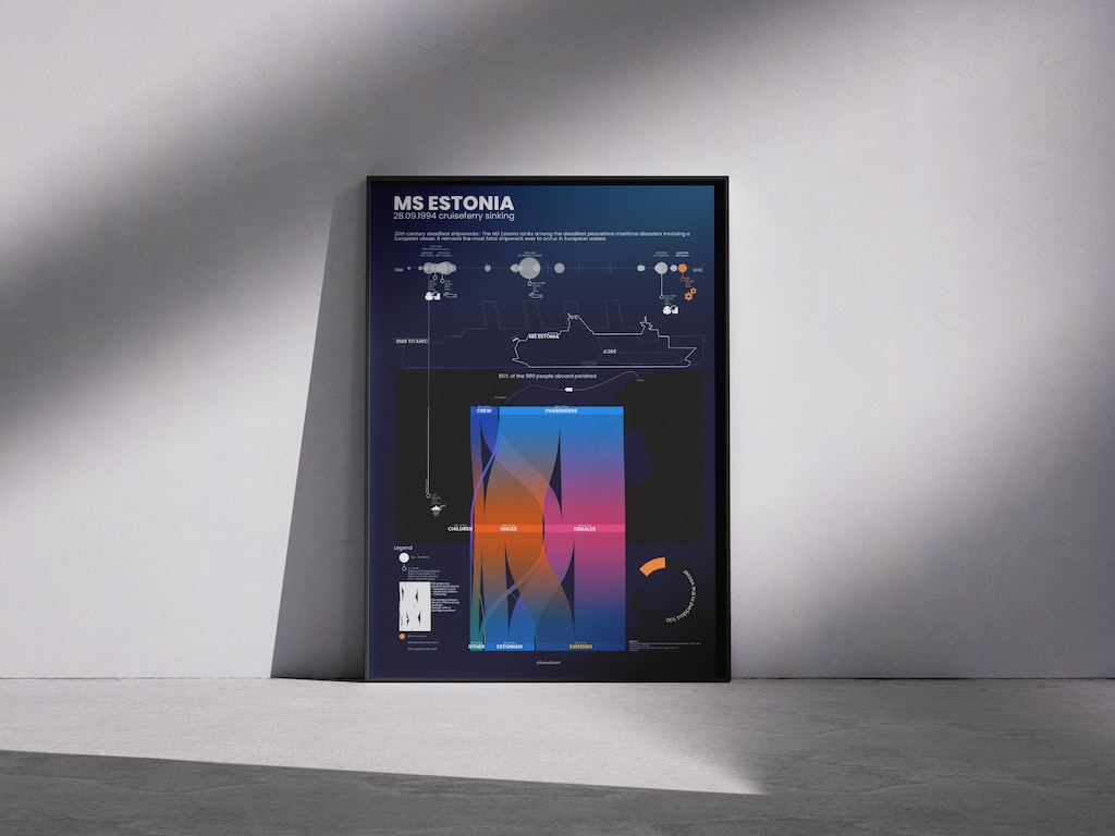
Why I Chose This Subject Estonia has always been special to me. It’s my country of heart. So when I heard about the sinking of the MS Estonia, it stayed with me.I first learned about it during my Erasmus year in Tallinn in 2005. I was young when it happened in 1994. Too young to remember it being covered at the time. But in Tallinn, the memory was everywhere.When I decided to make a data art piece about this tragedy, I knew it had to be more than facts on a page. I wanted to ask questions: Which shipwrecks shaped the 20th…
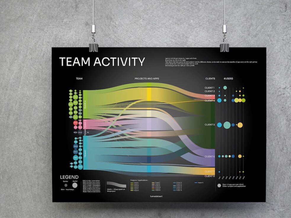
How can data art help leaders manage teams more effectively?
I designed this visualization to demonstrate how data art brings value to business management. It may not replace daily dashboards, but it offers a strategic perspective for quarterly reviews or team retrospectives. This kind of visualization helps answer critical questions: How are resources, time, and energy being spent? Who are your main clients? Are your efforts aligned with the right accounts and priorities? These insights are fundamental, especially for B2B organizations where alignment with strategy is key. Why This Matters for Leaders As a manager, you need more than just operational numbers.…
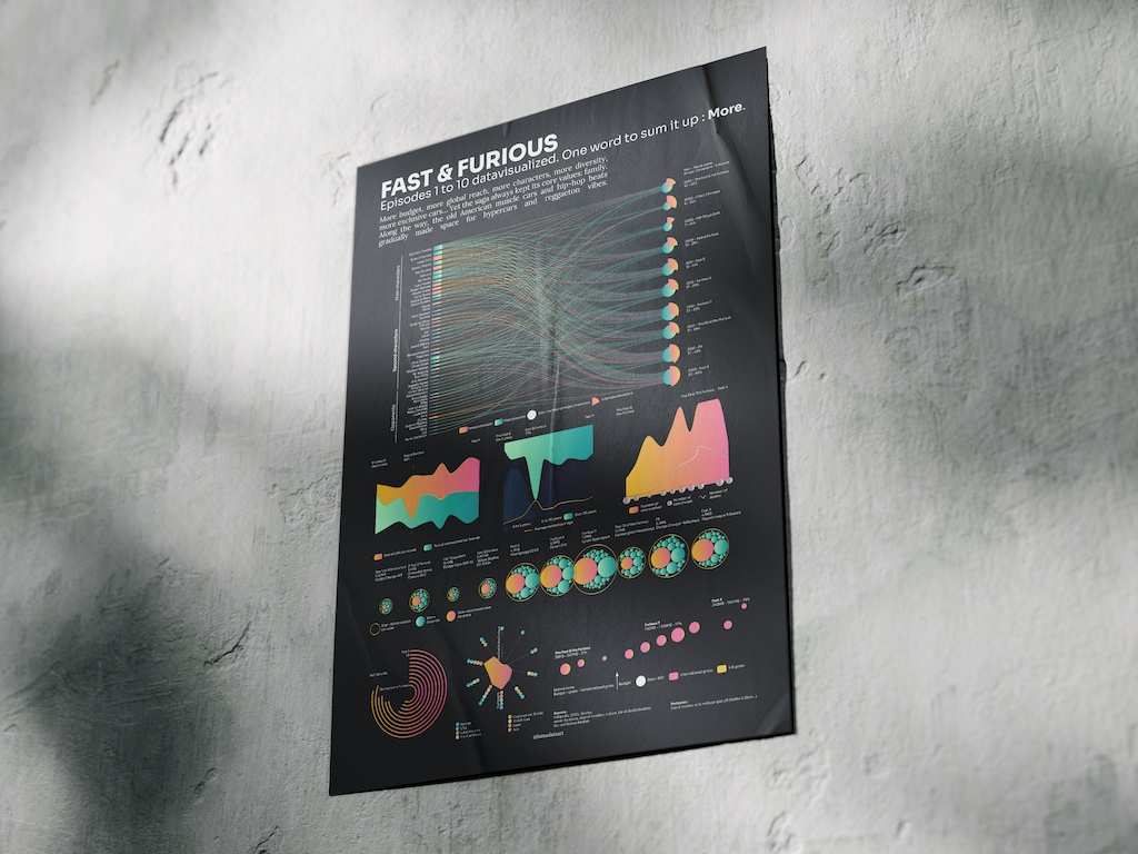
I discovered it in 2001 when the first movie was available in DVD. I enjoyed the cars, the characters, the friendship, Toretto’s bad ass band and the soundtrack (I listened it in loop while doing those datavisualizations). It was really cool and quite new compared to other cars movies. Year after year, I discovered new episodes while my life evolved. That's why I decided to create a datavisualization about the Fast & Furious movies.But how do they handle to make more than 10 movies about cars addict friends ? Movies evolved of course. But how ? Concretely, what is the difference between…